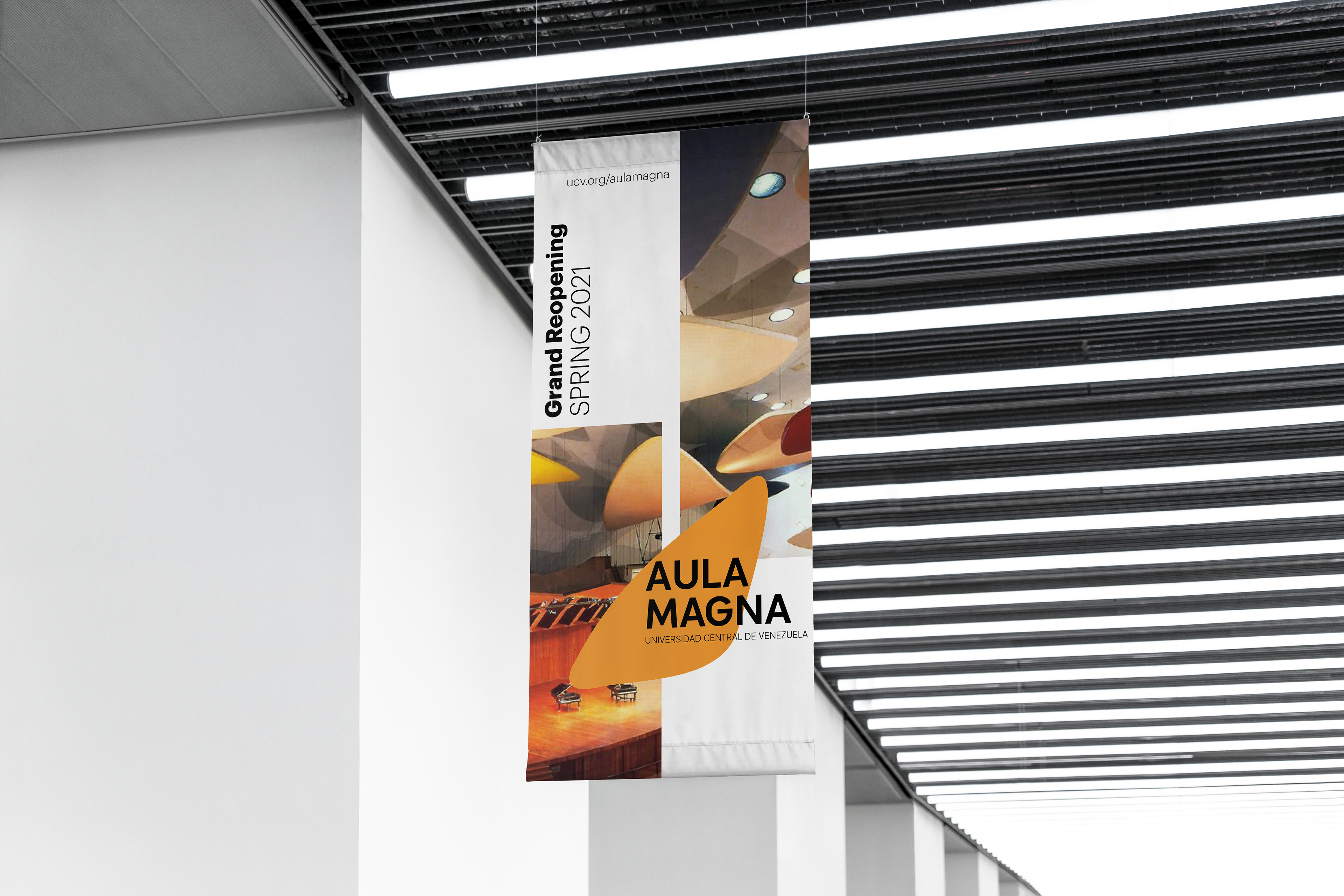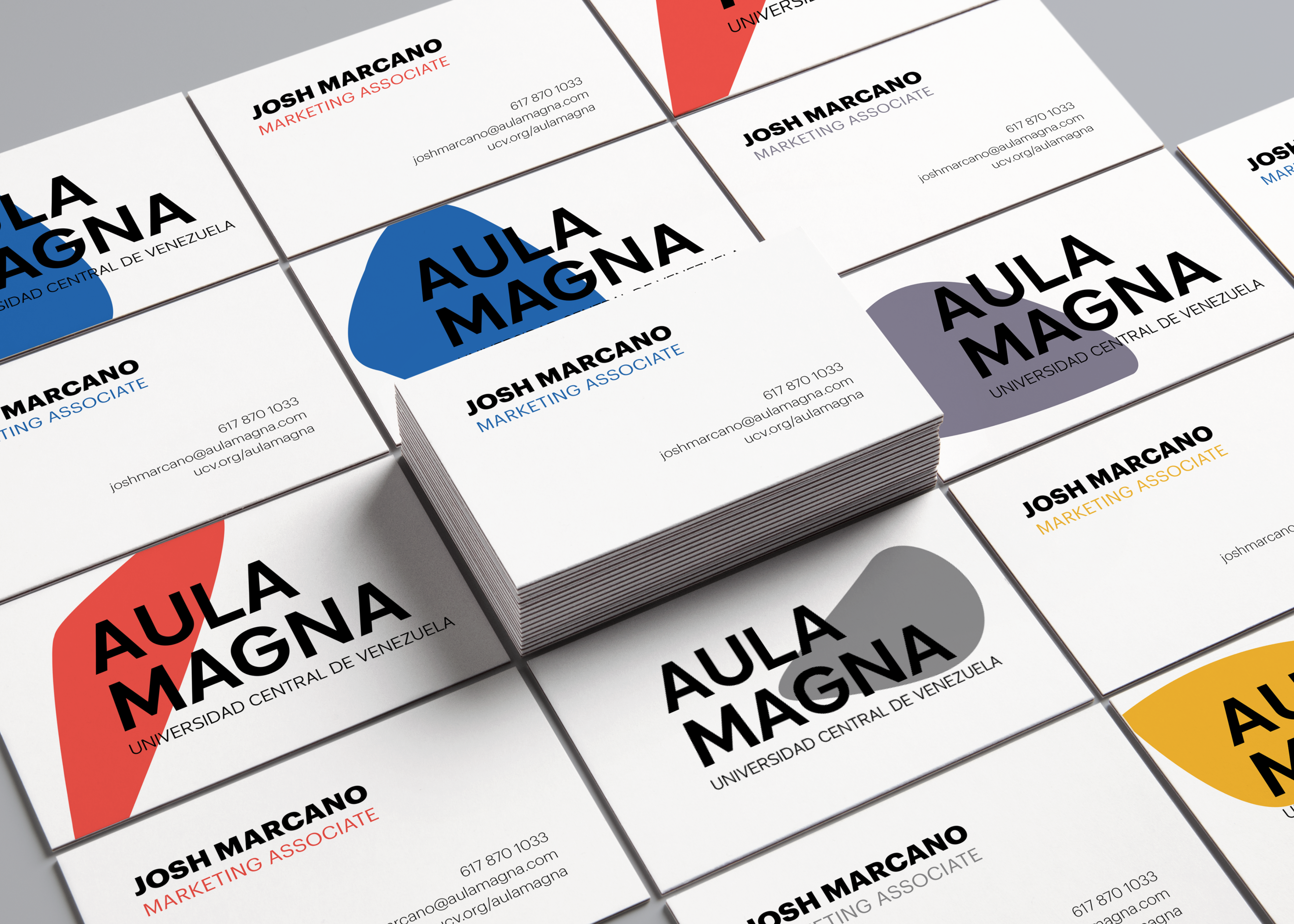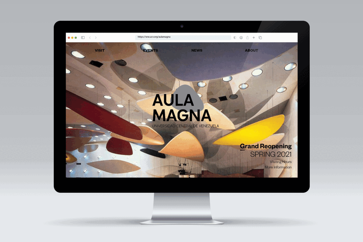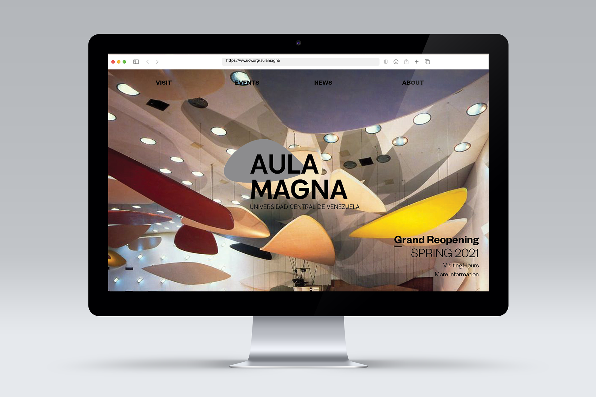
A flexible identity created for an iconic Venezuelan landmark.
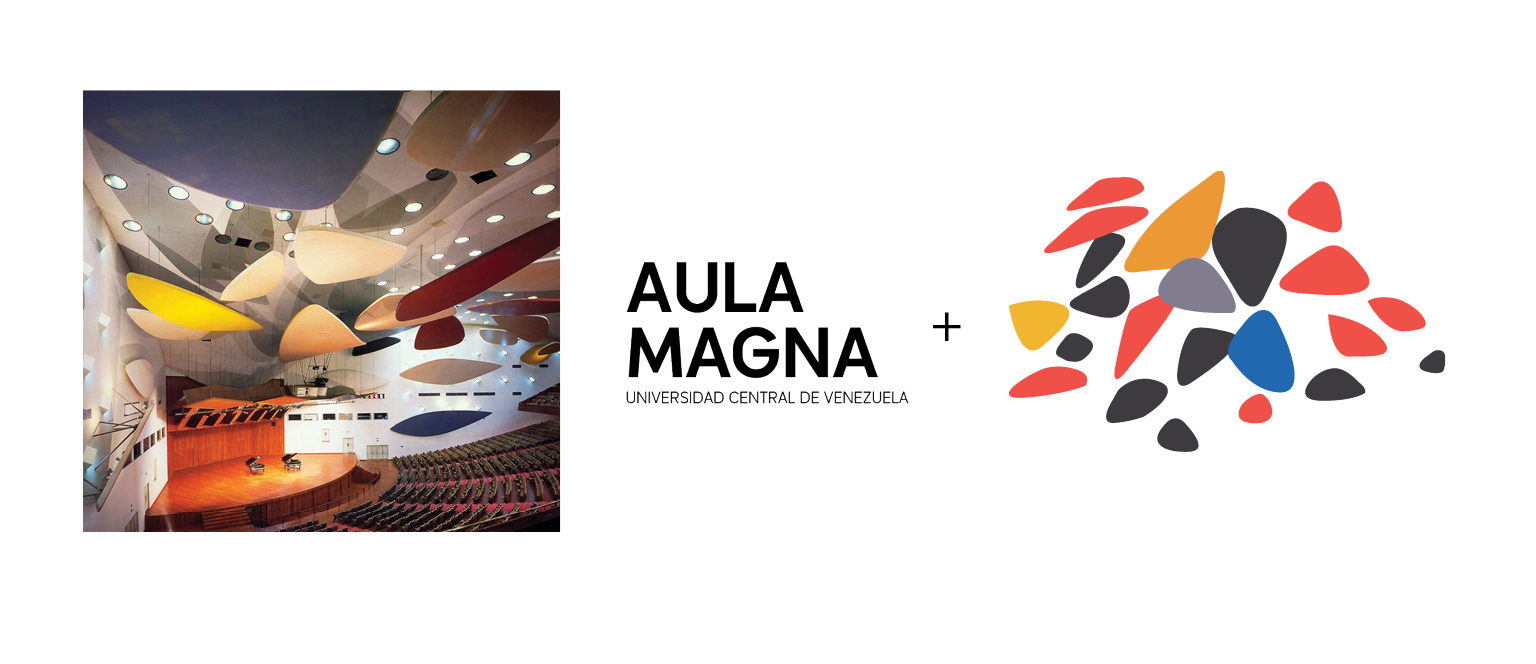
This rebrand aims to modernize a forgotten national gem by celebrating the art pieces that hang in its ceiling.
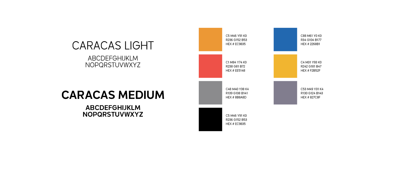
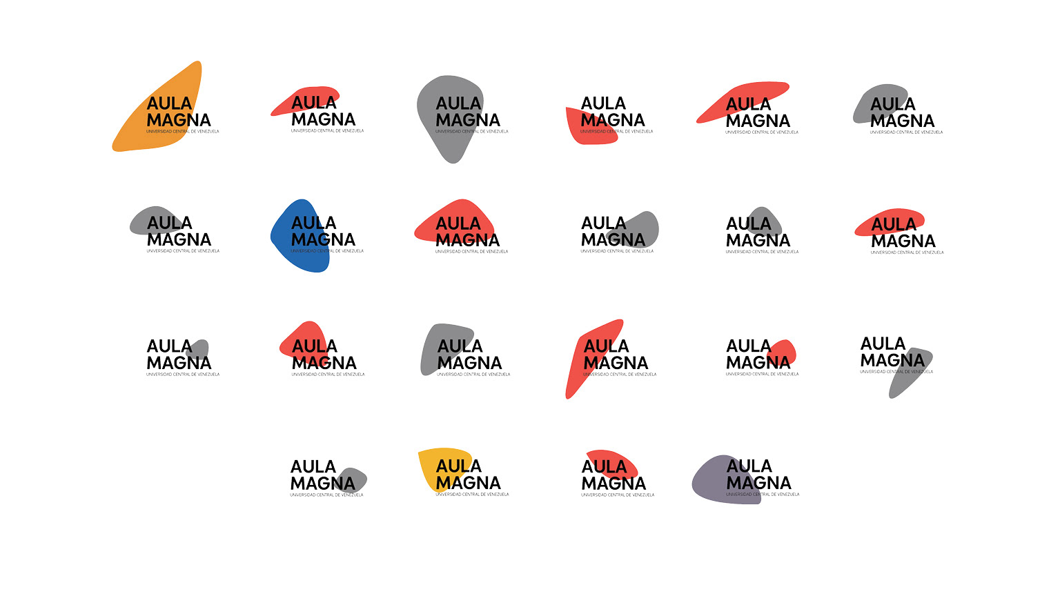
The original drawings created by Alexander Calder were traced to create the shapes that alternate behind the word mark. They keep their original colors and relative size when compared to one another.
The typeface used was developed by a Venezuelan type foundry and keeps a left alignment throughout the identity.